
A responsive design – or mobile-friendliness – means a website’s display is optimized for all screen sizes. No more pinching, zooming or microscopic fonts on small screens. Once a novelty in web design it is now a must-have feature. It determines the quality of the mobile visitor’s experience and affects the site’s ranking in searches.
A non-responsive website is a bad idea. It makes for a poor user experience and hurts your google ranking.
It Makes a Difference
Between November 2014 and August 2016 Google would add a “Mobile-friendly” notice to mobile search results for mobile-friendly websites. All websites are now expected or assumed to be mobile-friendly and the notice is gone. But the importance of having a responsive website remains.

In November 2014 they also announces that they were “experimenting with using the mobile-friendly criteria as a ranking signal”. In other words, websites that are “mobile-unfriendly” will rank lower in search results directly affecting traffic from searches.
4 Criteria
Google list the following criteria for mobile-friendliness:
- Avoids software that is not common on mobile devices, like Flash
- Uses text that is readable without zooming
- Sizes content to the screen so users don’t have to scroll horizontally or zoom
- Places links far enough apart so that the correct one can be easily tapped

Ethan Marcotte’s seminal 2010 article explained responsive web design this way:
Rather than tailoring disconnected designs to each of an ever-increasing number of web devices, we can treat them as facets of the same experience. We can design for an optimal viewing experience, but embed standards-based technologies into our designs to make them not only more flexible, but more adaptive to the media that renders them. In short, we need to practice responsive web design.
Check Your Website
You can test your site for responsiveness on Google’s test page.

You can see what your site looks like on screens of different sizes in a number of ways. One is another Google tool: the Resizer.
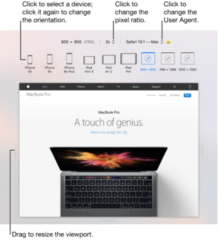
Another is Safari’s Responsive Design Mode (found in Developer Mode) which has pre-set dimensions for various Apple devices.
But the easiest is to simply grab the right edge of your browser with your mouse and drag it to the left to shrink the screen width (you can do the same with the bottom of the browser). If your site is responsive the items on the page will rearrange themselves and adapt to the smaller screen sizes.
